Feedback of website
1.The color of the personal name of the web page blends with the background.

2. The project sections displayed on the homepage are too single, you can add pictures to better highlight the theme.

Feedback of project4:
1.The research process is too much.
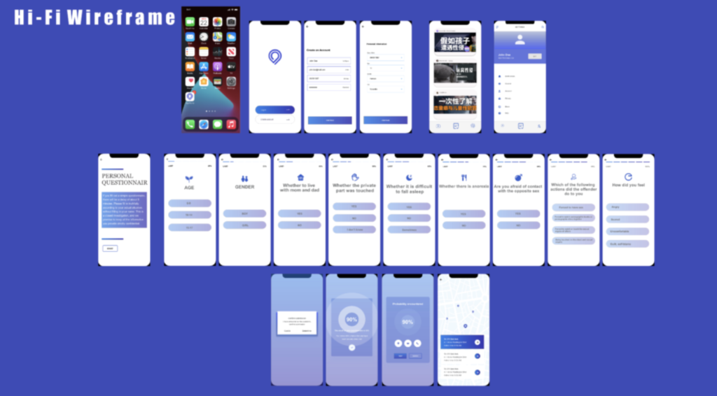
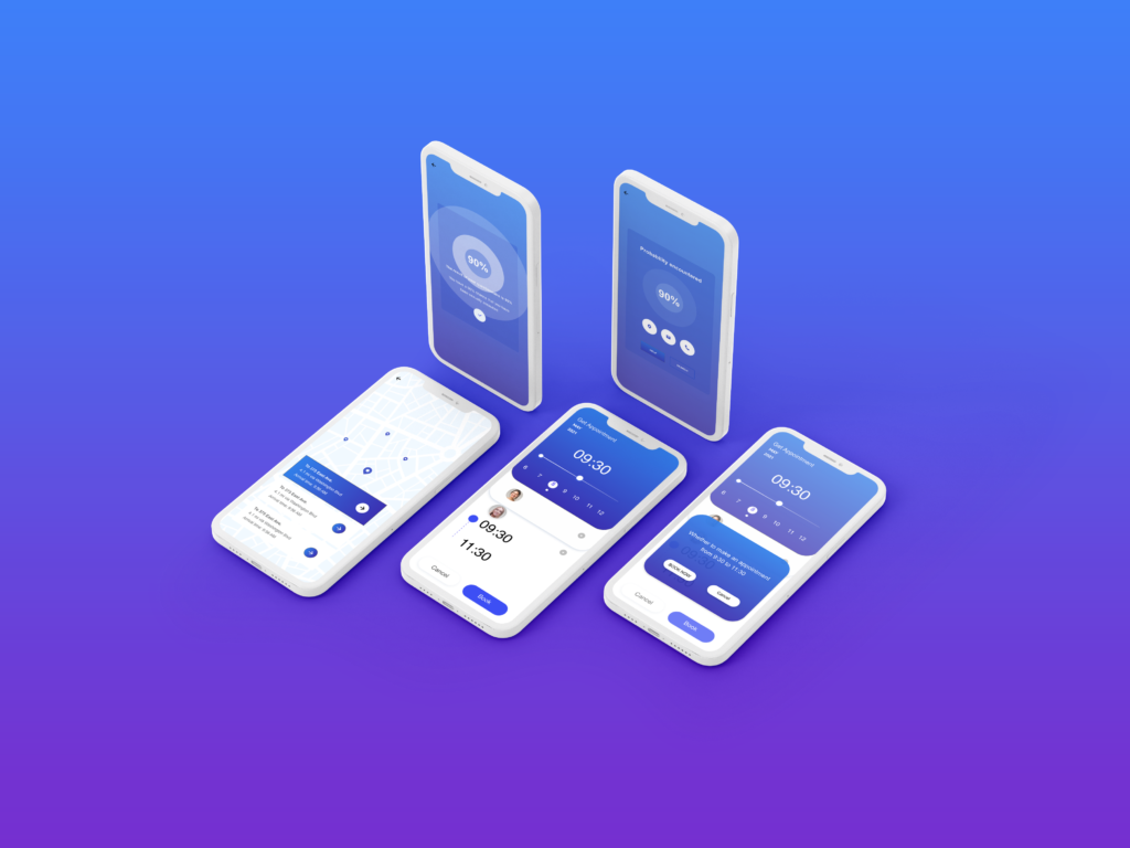
2. The visual performance is not clear enough, and the display of the main function interface needs to be clearer.

Changes I have made:


About the website:
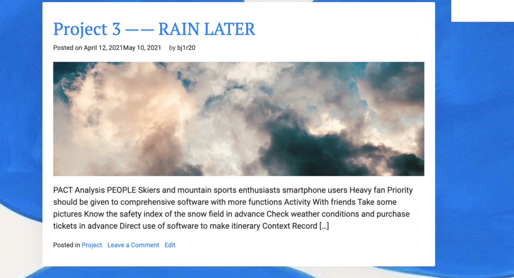
I adjusted the font color and overall background image to make the website look clearer. I also added feature images to each blog and project so that each module can be seen more intuitively.
About the Project 4:
At the end of the project, I displayed the questionnaire interface separately, and added the function of making appointments through positioning.